When it comes to office design, the debate at the moment seems to be between the open plan camp and those who think private offices are more productive work environments. While this is an important debate, what we hear less about is how office design can reflect the identity and objectives of the company itself. In fact, creating a cohesive connection between your company's identity and the design of your office has such marked benefits, it could be the next big thing in office design; it's all part of an immersive brand experience. An office design tied to your company's key principles is a way to stand out in a crowded market, acting as a billboard to the qualities that make you unique.
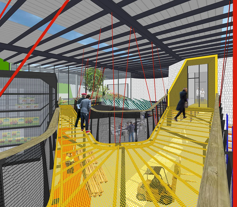
Imagine you're a confectionary company, would you rather walk your prospective clients through a drab, beige office which could house any company in the world? Or an office where the carpets and desks match the colours of your various sweet treats? Where a large window opens onto the manufacturing floor so everyone can see the products as they're made? Perhaps there's even a sweetness in the air which makes people think of their favourite lolly in your collection (hey, scent marketing is a thing). Which set of prospective clients is more likely to seal the deal after their meeting? And winning new clients is not the only benefit.
Many of Google's office designs feature things like slides, ping-pong tables and games rooms to highlight their sense of fun and creativity. Image Source: Dezeen
Many of the tech giants in Silicon Valley have been leading the way in this approach to office design for years. Think of Google's zany office designs, with putting greens, revolving bookcases and internal slides. All, of course, in Google's recognisable primary palette of red, yellow, blue and green. Google also has a '150 feet from food' rule, which means a cafe, restaurant or snack bar is never far away - all free for employees, too. And while Google's treatment of the office as a playground has been criticised, the office designs help to reinforce the idea that Google is a young, innovative company which values creativity, fun and its employees' wellbeing.
Artwork by local artists throughout the Facebook Headquarters reinforces the idea that Facebook is a creative company. Image Source: Facebook
Similarly, Facebook's HQ by Frank Gehry is designed to boost creativity and promote productivity with plenty of opportunities to socialise. Art is incorporated throughout the building and spaces are designed to provide a combination of interaction and focus depending on what's required to get the job done. It's wonderful to see a rooftop garden where employees can relax, demonstrating the company's commitment to the health of its workers.
Google HQ in Mountain View, California is more like a university campus than a typical office block. Image Source: Tripsavvy
Where Google's Mountain View HQ is a sprawling collection of buildings based on the concept of a university campus (complete with free Google bikes to ride to your next meeting), Apple's Cupertino 'doughnut' is a self-contained, inward-looking courtyard design. Inside and out, the perfect circle espouses the company's rigorous approach to product design. From the precision-milled aluminium door handles to the wood panelling harvested at just the right time (mid-winter) to ensure a low sap content, Foster + Partners seem to have considered and perfected every detail and refined it into aesthetically perfect form.
Apple Park in Cupertino, California is a perfect circle and epitomises the company's rigorous design philosophy and was intended to represent a refuge, with a pond and drought-tolerant landscaping at its centre, but has been criticised for being inward-looking. Image Source: Wikipedia
These companies are using their office design to make a statement about their products. And it's a powerful statement. Where Google has a large range of products suitable for many people and builds its operating system on open-source software, Apple's approach is to focus on a core suite of products and ensure stability by controlling both software and hardware. It's not hard to see the parallels in the way they approach their office design.
Closer to home, Medibank Place designed by HASSELL is a great example of a company using their office design to tell the story behind their brand. As the architects explain, the building is part of the company's strategy to "live its purpose to the core and create better health outcomes for its members, employees and the community".
A sinuous ramp encourages workers to walk to their level rather than take the elevator at Medibank Place, Melbourne. It also acts as an atrium, letting natural light deep into the building. Image Source: HASSELL
The design achieves this in a number of ways. For example, a beautiful, sinuous ramp is the centrepiece of the building, encouraging people to walk to their desired level, rather than take the elevator. It also acts as a void in the middle of the building, letting natural light into that centre space of an office tower which always feels dark and gloomy. In addition to the provision of natural light, circadian lighting mimics the natural sunlight rhythms to support employee biorhythms.
A variety of workspaces provide options for various activities. Standing desks encourage workers to stand more during the day. Image Source: HASSELL
Employees can work from a range of spaces depending on their needs and preferences. Choose from a standing desks or duck into more private booths for focussed work. You can even step outside onto wifi-enabled balconies for some sunshine and fresh air.
Greenery on the building's facade helps to protect in from the sun, creates a nice outlook from inside and also gives back to the wider community. Image Source: HASSELL
Plus, the building is home to 2,300 plants inside, as well as planter boxes on the facade and a 25-metre high green wall facing the street. The greenery, of course, offers numerous benefits to staff and visitors, helping to boost wellbeing, productivity and air-quality. Medibank's office design proves the company is committed to the health and well-being of its employees, customers and the city too. Kylie Bishop, Medibank's Executive General Manager, People and Culture, says the office design, "epitomises our purpose and value and all that we stand for."
There are encouraging signs this approach is paying dividends already. HASSELL report, "just four months after Medibank moved in, 79% of employees reported they were working more collaboratively with their colleagues and 70% said they are healthier working at Medibank Place. What’s more, 66% of employees said they were more productive at Medibank Place and the call centre saw a 5% reduction in absenteeism." Good office design can be a powerful strategy to increase productivity, support employee retention and attract new staff. Who wouldn't want to work in a building that makes you feel healthier?
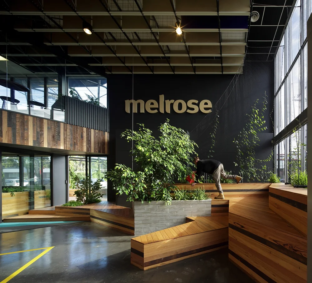
Melrose Health's brand philosophy informed our approach to their office design.
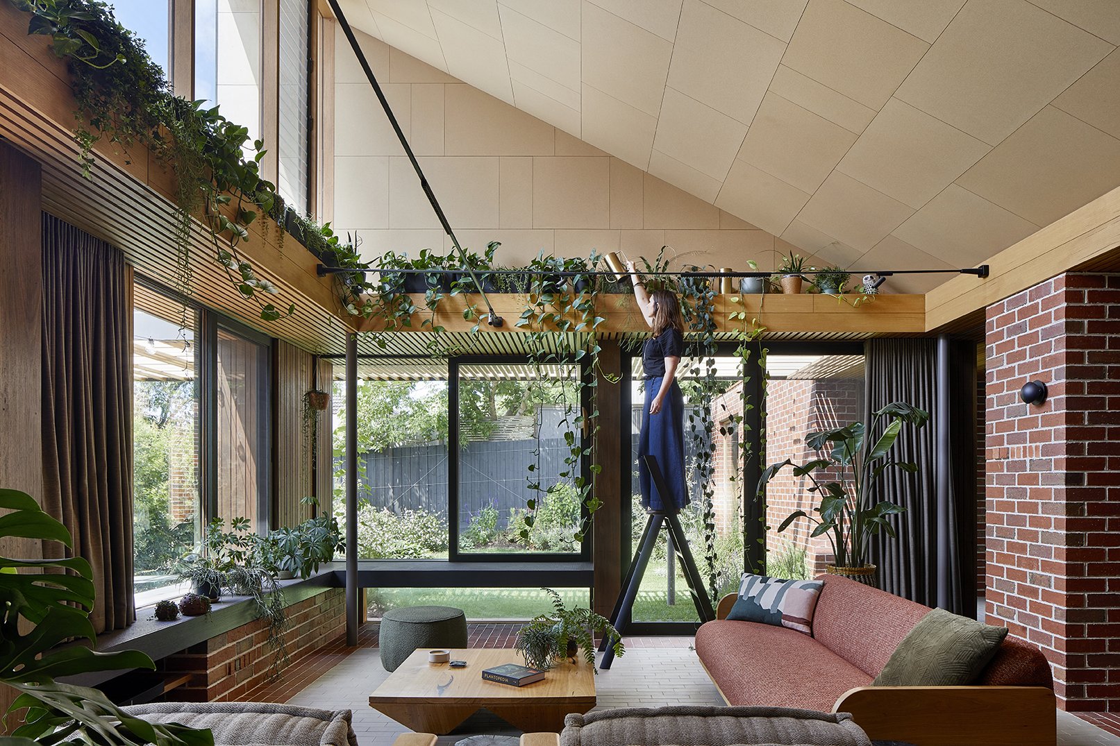
Our own Melrose Health project is an example of how a holistic approach to office design, taking into account the values of the business it will serve, can reap numerous rewards. We transformed a generic office and factory space into a workplace that embodies the health and wellness philosophies of Melrose Health. Greenery has been incorporated into the design wherever possible to improve the look and feel of the space and to enhance the indoor comfort and air-quality, harnessing nature to create a healthy workplace just as Melrose use natural products to create their health products.
Internal greenery improves the health and well-being of staff.
We also connected the office and factory, giving visitors an insight into the machinations that go on behind the scenes and to reinforce the sense of a unified workplace. Tahnee Jones, Melrose Health's Head of People/HR has noticed an improvement as a result of this office redesign. "By suffusing our brand in our team's workspaces, we aim to encourage the right tone to shine through", she says. "Whether that be the natural effect of the plants or the recycled timber to give that organic aura, it provides for an open, transparent environment where we are all closely connected. One thing is evident, aligning our brand to the space has been key to reinforcing what we are all working toward. Although we have not measured the kind of impact the environment has had on the team, I can say that the consistent feedback from everyone is how amazing this space is to work in and how it truly does embody our brand and provide for an innovate and collaborative workplace. There is a sense of pride about working here and when talking to the team about some of the benefits for working at Melrose, the office space is always mentioned as a highlight."
The new office design acts as a showroom for Melrose Health's brand.
Melrose Health's new office acts as a showroom for their brand and products, demonstrating the company is committed to health and wellness, not just for its customers, but its staff as well. That commitment strengthens their brand. "If you want to be a great consumer brand you need to start to build that brand inside your own building before you can create a real impact in the households of consumers", explains Russell Parker, CEO of Melrose Health. "Our office and factory are the home of our brand, and the wonderfully unique design expresses all the overt and subtle queues we want visitors and team members to experience as soon as they walk through the door. We also understand that great brands are created by great people and those people can choose lots of different places to work. One way we ensure they choose us is to provide a unique, inspiring and invigorating place to work. I do not know how to measure the return on the investment, but I am convinced it is an important part of our success."
A connection between the office and factory makes workers feel like part of one team and also gives visitors a look behind the scenes at how the products are made.
Sadly when it comes to offices, many think of good design as nice-to-have, rather than a must-have. Beyond the provision of desks, monitors and kitchen facilities, many employers don't take much more interest in the design of their office spaces. We think that's changing. Increasingly, companies are seeing the value of good design beyond their logo, stationary and/or packaging and bringing their design philosophy inside, too. While it's commonplace to spend money on branding and marketing, smart companies infuse their physical spaces, their shops and office with the same philosophies that define their brand. Designing an office to reflect your company's story is just as important as any advertising campaign or PR stunt. This realisation will underpin the next big thing in office design.


